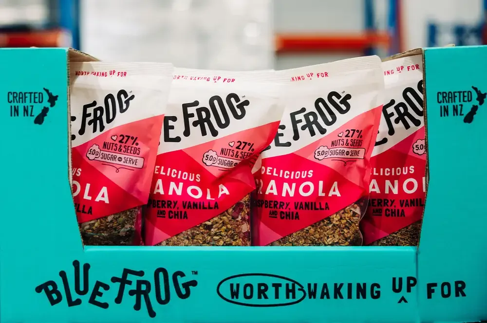
Blue Frog packaging design
As Senior Designer, I led the creative development for the Blue Frog Breakfast cereal range, creating distinctive, shelf-impacting designs that strengthened brand recognition and appealed to consumers. Working collaboratively with marketing, brand, and production teams, I guided projects from concept through to print-ready artwork, ensuring every design balanced creativity, commercial objectives, and production requirements while maintaining consistency across the brand portfolio.
Before
From Illustrative to Inviting
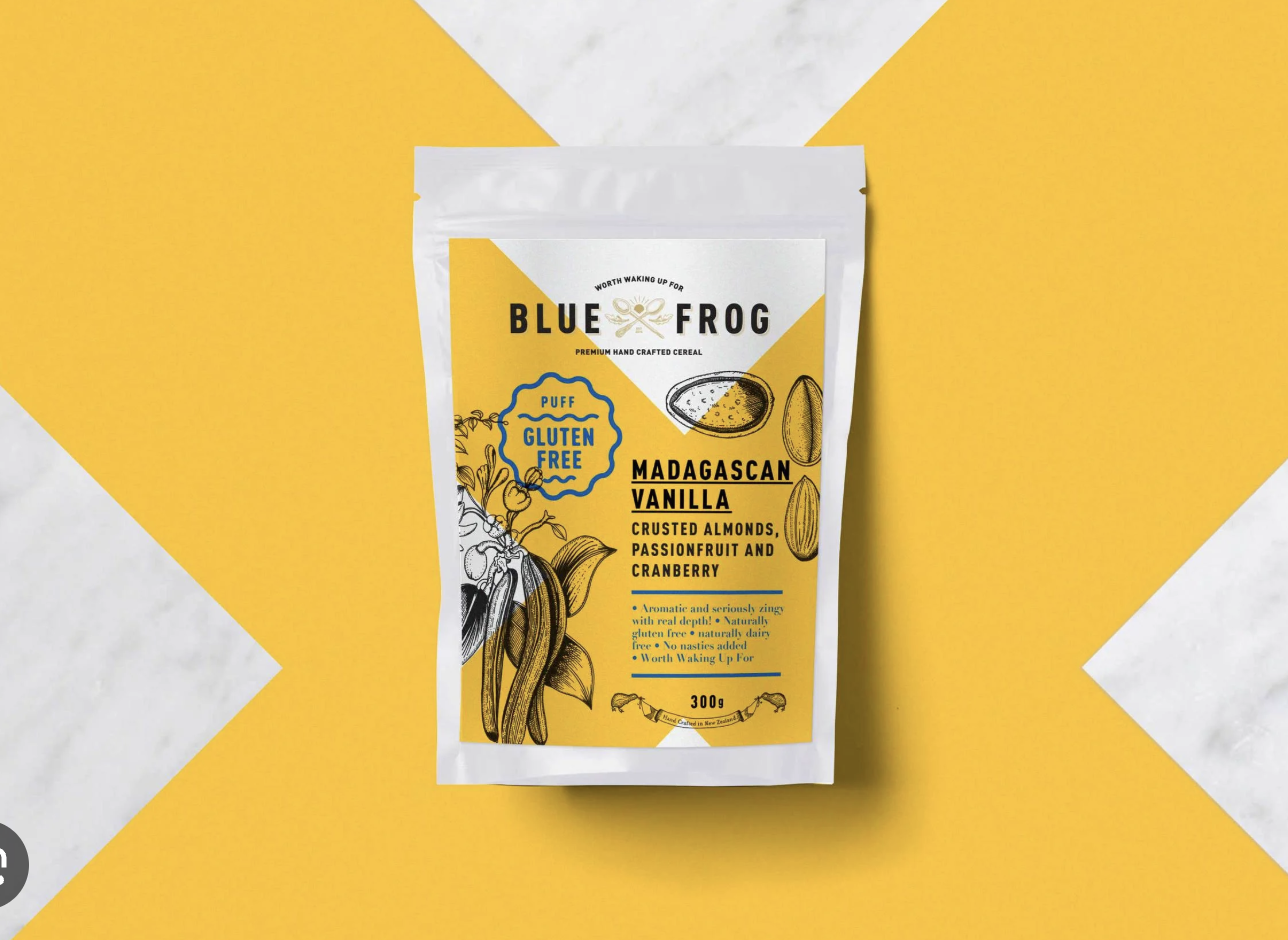
The original packaging was beautifully illustrated, but the client felt it read as too precious and formal — missing the fun, approachable energy the brand needed on shelf.
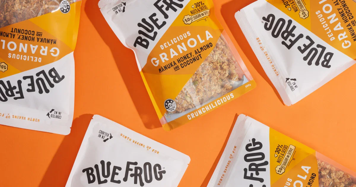
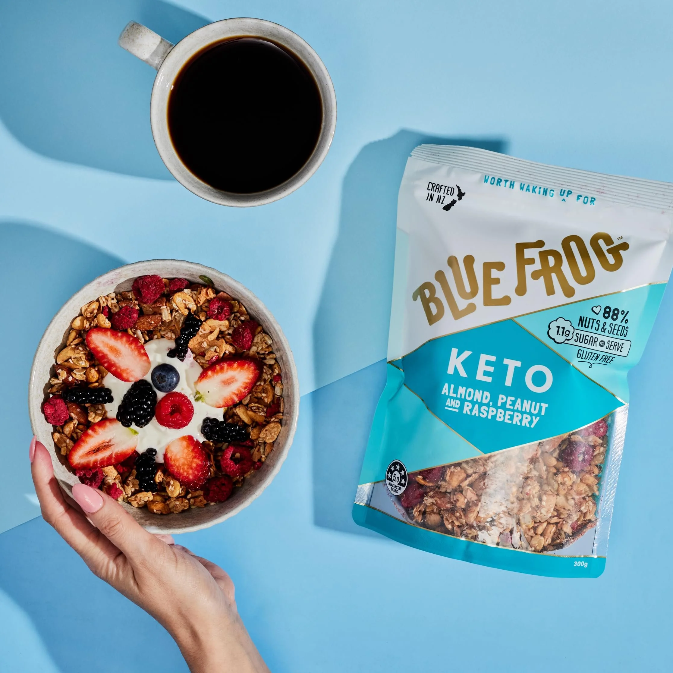
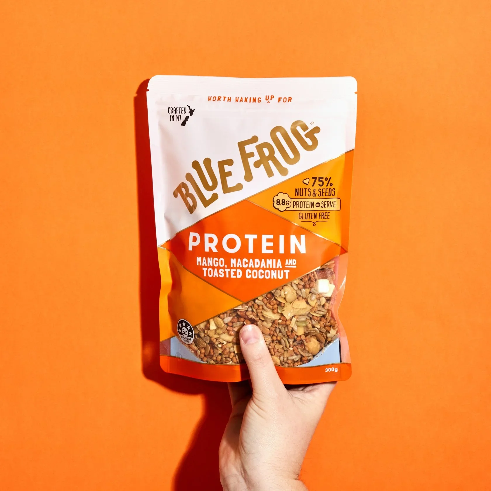
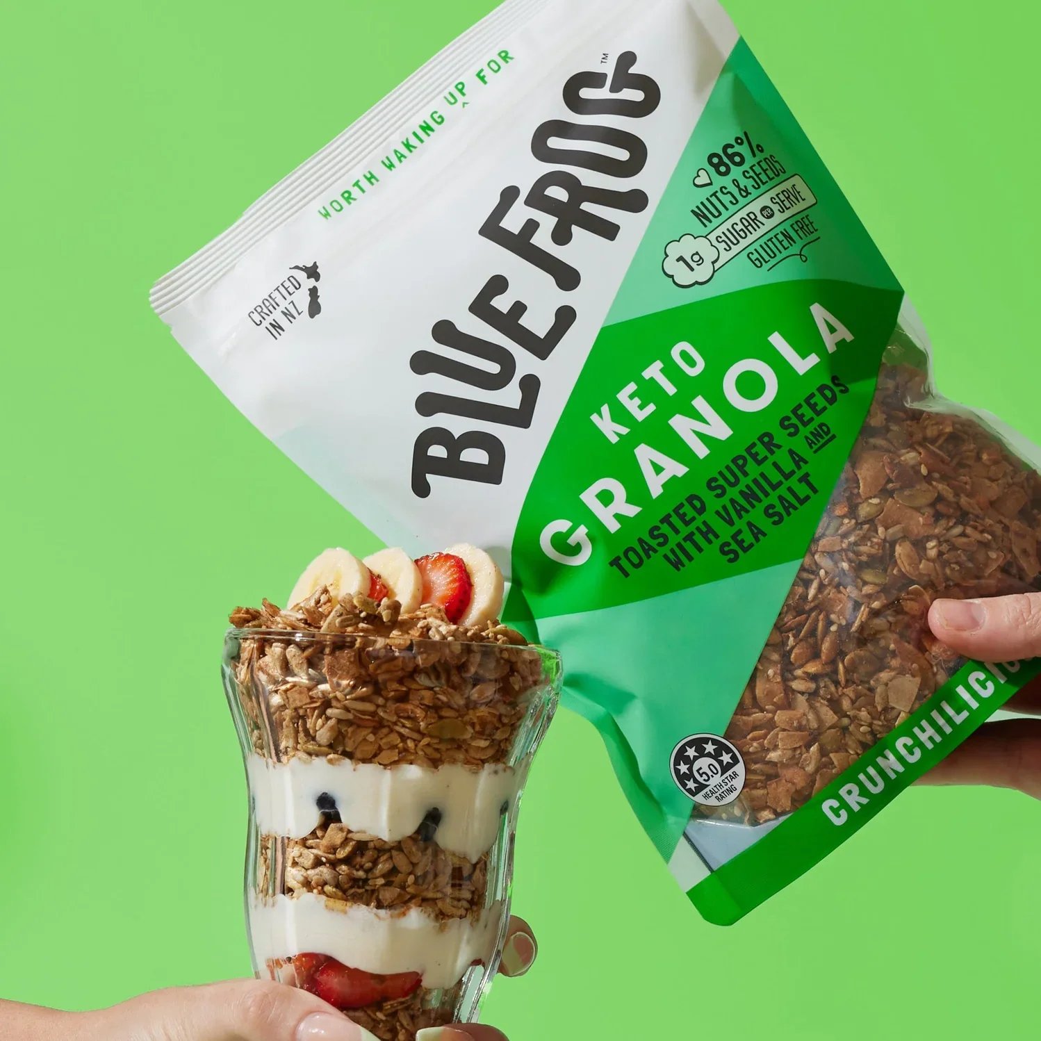
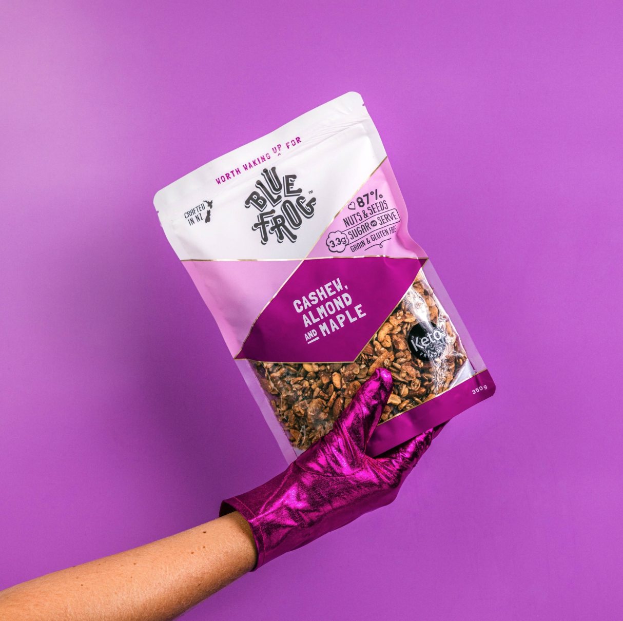
The redesign solved this with a bold hand-drawn wordmark, a clear product window to build appetite appeal, and icon badges for instant proof points (protein, gluten free, health rating). A stronger type hierarchy — playful headline, punchy flavour callout, supporting detail — guides the eye with ease. The result: a brand that's still premium, but genuinely worth waking up for.