UI Digital APP Design
Overview
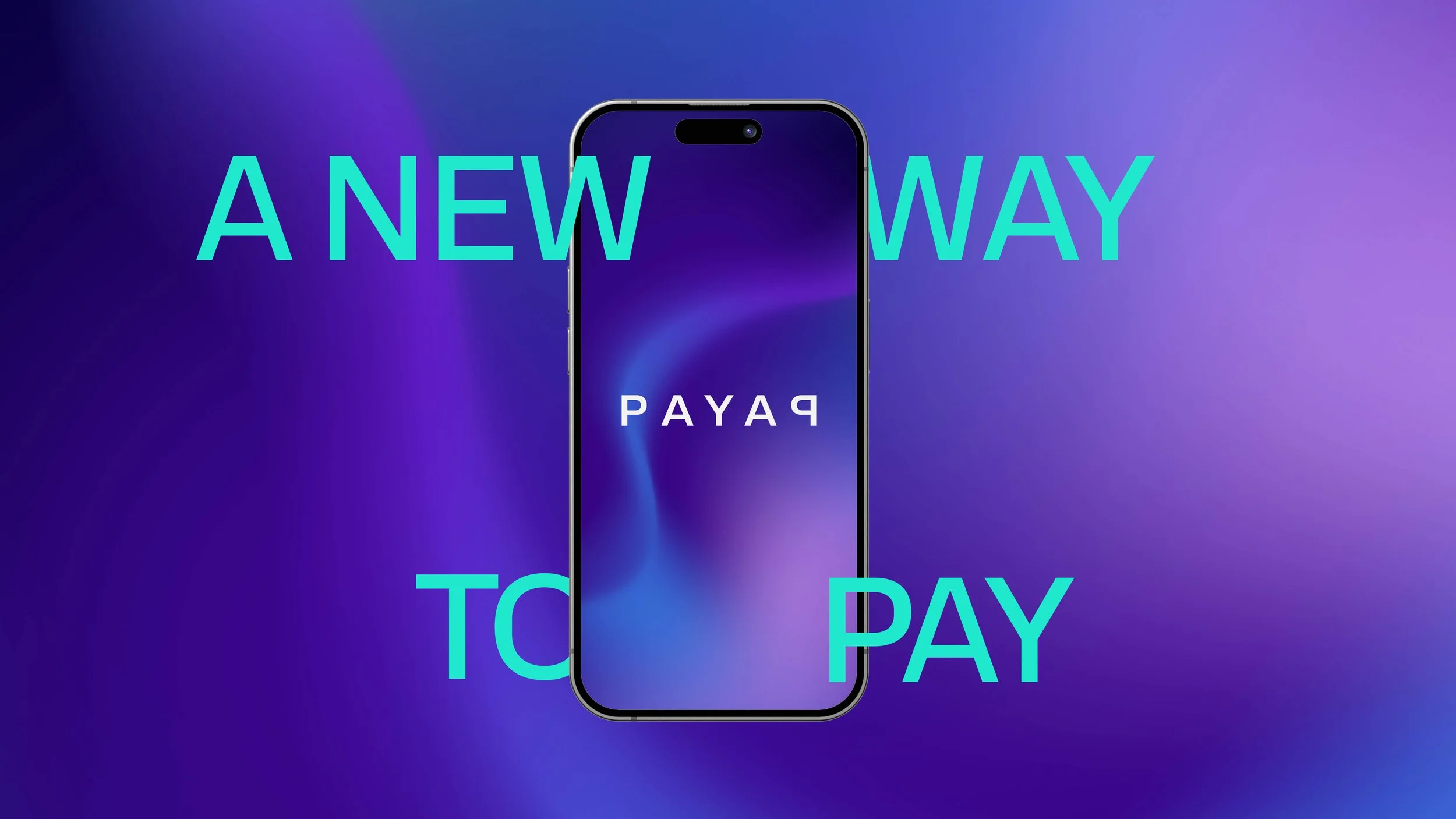
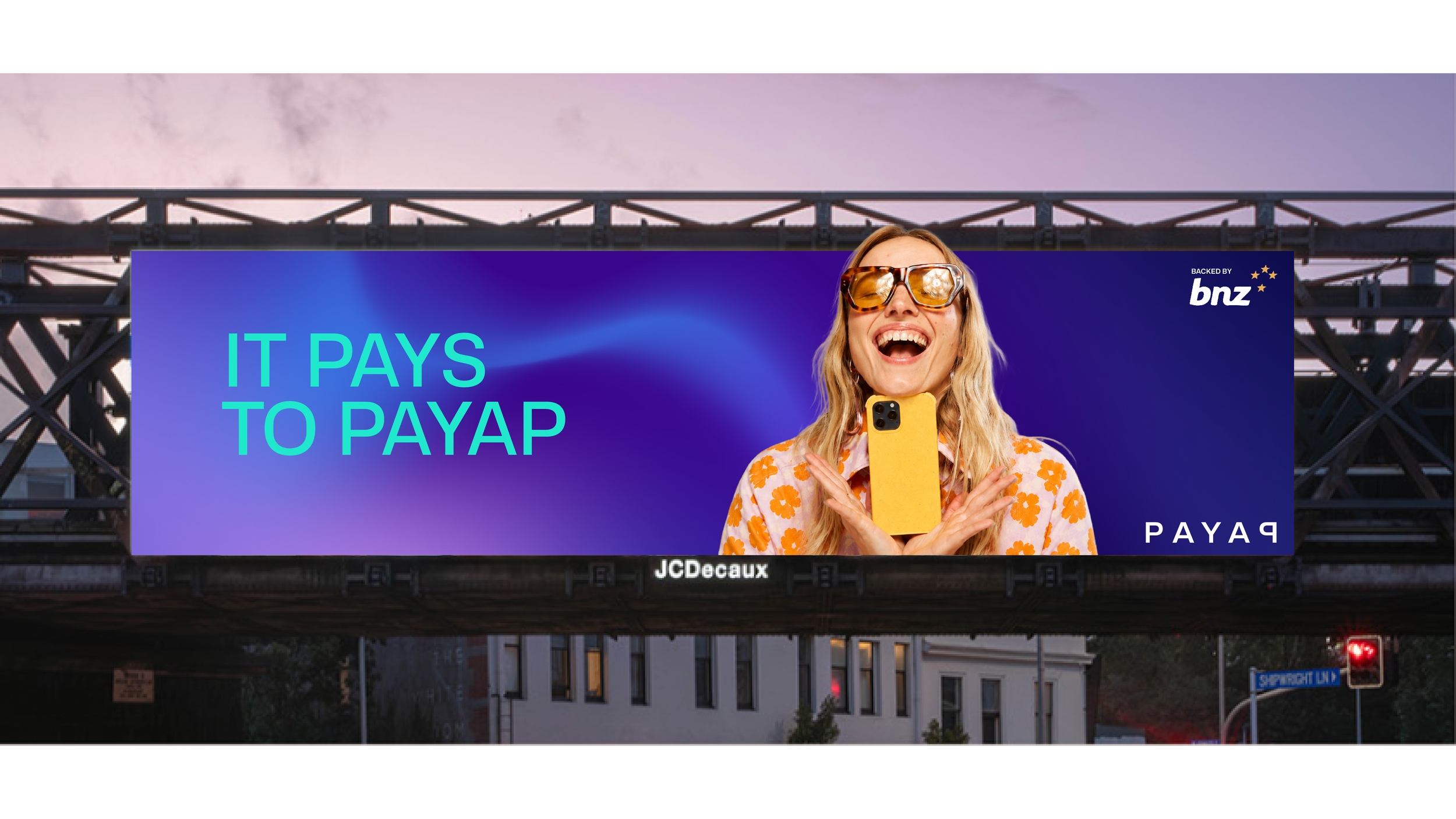
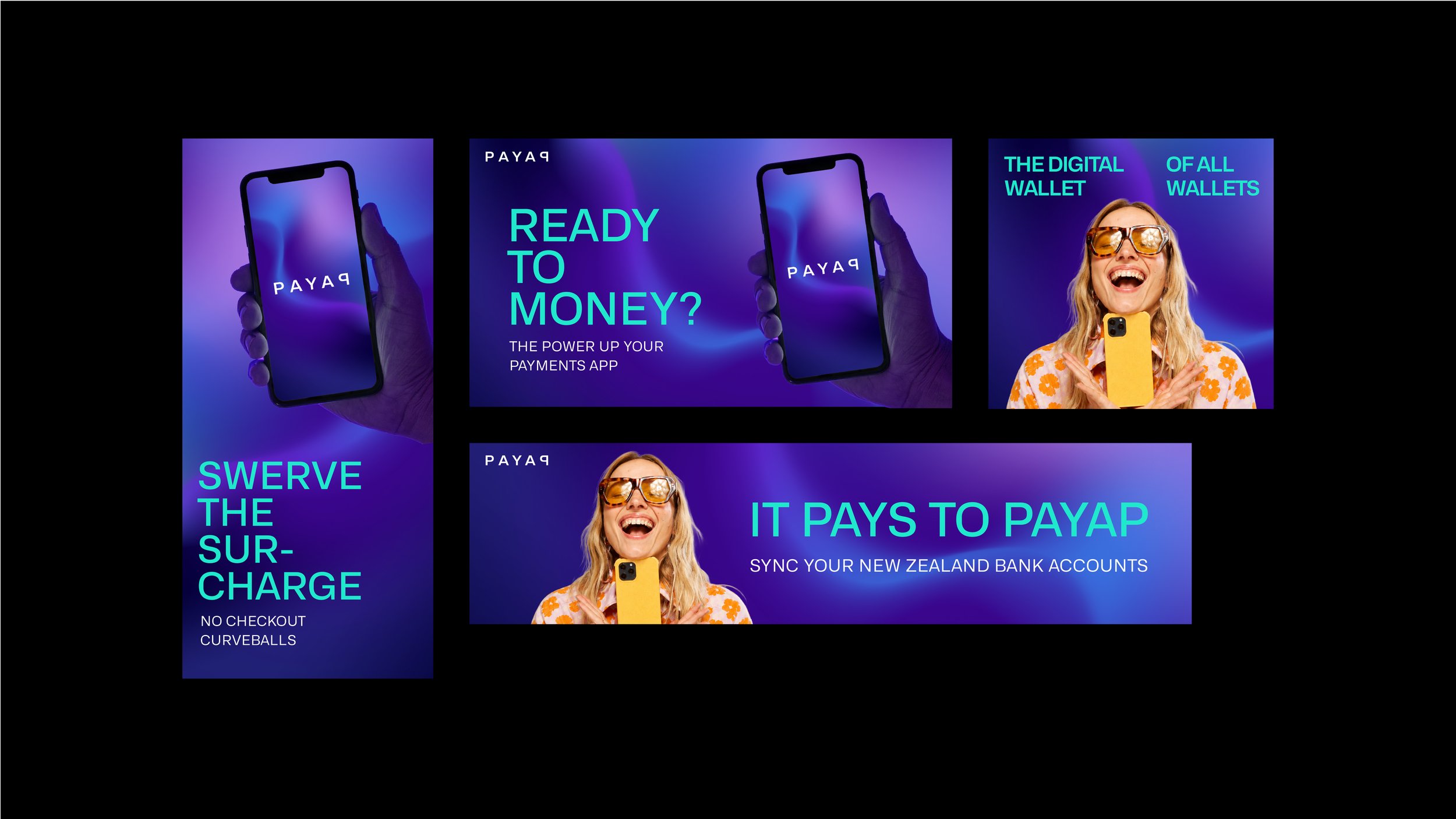
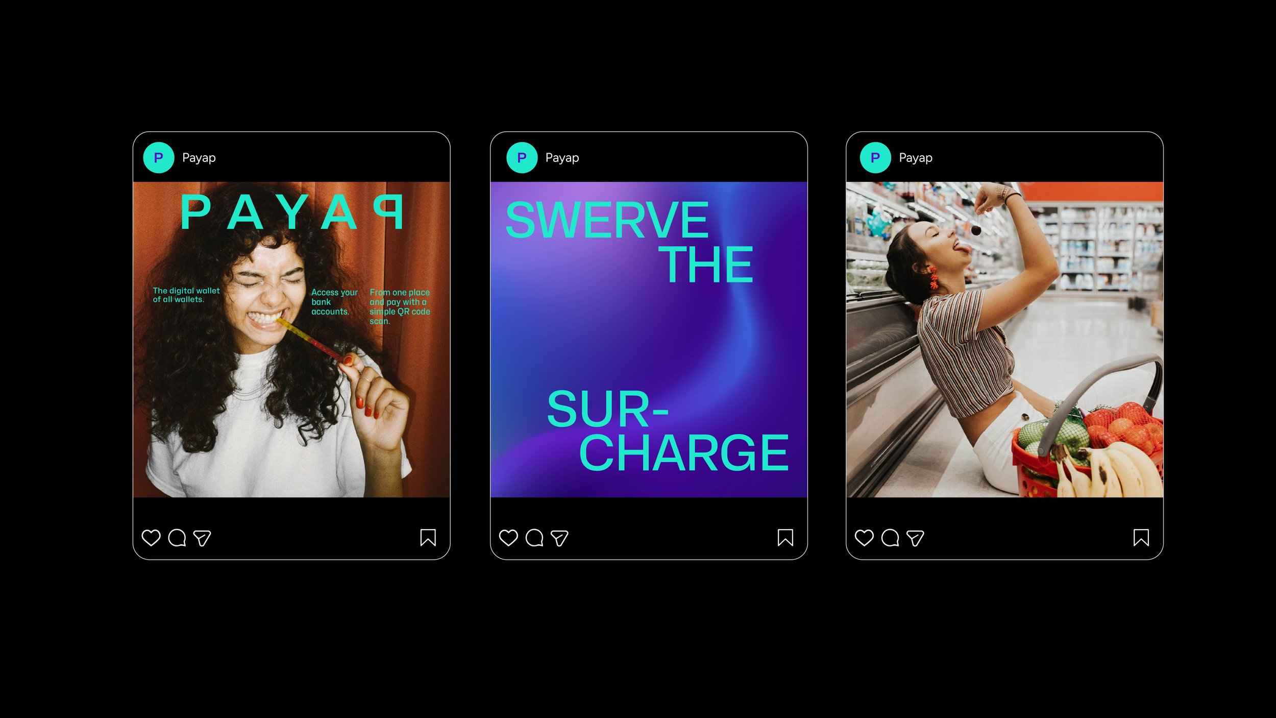
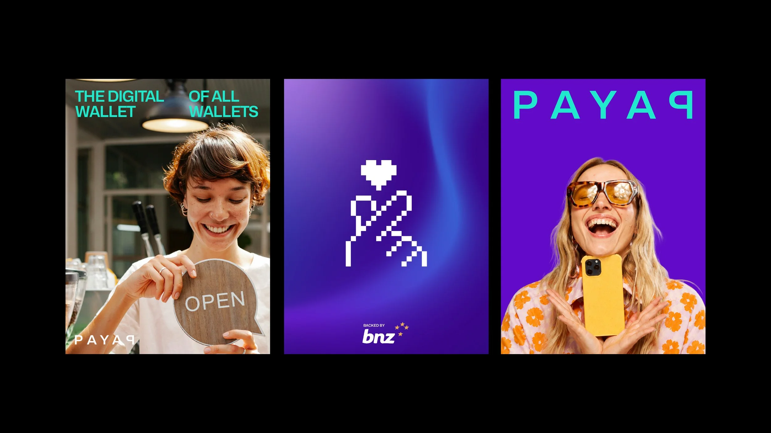
Payap is a BNZ next-generation payments app designed to simplify and enrich the way people manage money. More than just a payment tool, it offers a fully integrated experience combining accounts, payments, and rewards – all in one easy-to-use platform.
The Challenge
Build a brand that stands out in a crowded fintech space, while staying true to Payap’s core values: playful, straightforward, and inclusive. The goal was to create a visual and user experience that felt light, human, and genuinely helpful – never cold or complicated.
The Result
Payap’s brand experience is bold without being loud, fun without feeling gimmicky, and smart without being overly complex. It delivers a money experience that feels light, empowering, and genuinely enjoyable.
visit payap.com